PLANNED PARENTHOOD
PROBLEM:
How might we develop a wayfinding strategy that guides a diverse set of patients and faculty, preserves confidentiality, and reduces patient anxiety?
SOLUTION SUMMARY:
Through our room numbering system strategy, use of inclusive iconography and language, and integration of the brand voice and visual standards, our team was able to address the needs of the staff/organization, and the confidentiality and anxiety of patients.
BACKGROUND:
Planned Parenthood of Greater New York (PPGNY) is a provider of sexual/reproductive health services and information. Ultimately, PPGNY advocates for advancing equity and improving health outcomes for all.
PROJECT GOALS:
Develop a wayfinding system that allowed patients could independently navigate beyond the check-in desk
Conduct an assessment of language and iconography; Make refinements and updates where necessary
Define a system that could be rolled out across multiple facilities, and adapted as necessary
Integrate the brand carefully so patients can locate the building without inviting unwanted attention
Welcome visitors from the neighborhood local to the facility (Downtown Brooklyn)
DEVELOPING THE PRODUCT:


The Welcome Moment
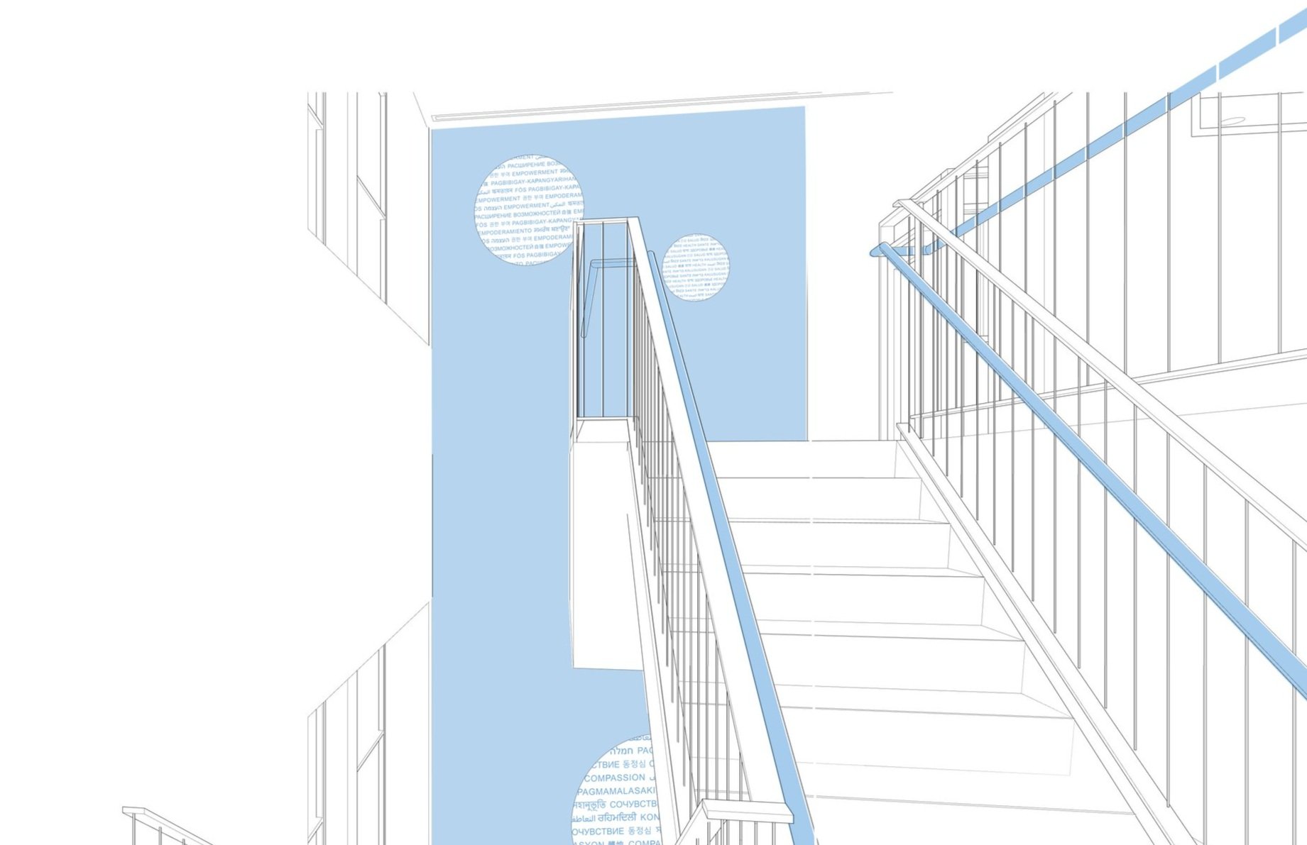
From the exterior, PPGNY is intentionally discreet. Upon entering the building, we designed a welcome moment that is bright, clean and connected with the brand. This experience features a “Welcome Disk” that reads Welcome in the top 15 languages spoken in Downtown Brooklyn. This disk is considered an “Easter Egg”, where visitors have a hidden, brief, yet exciting moment of discovery to reframe their anxiety in a small yet impactful way.


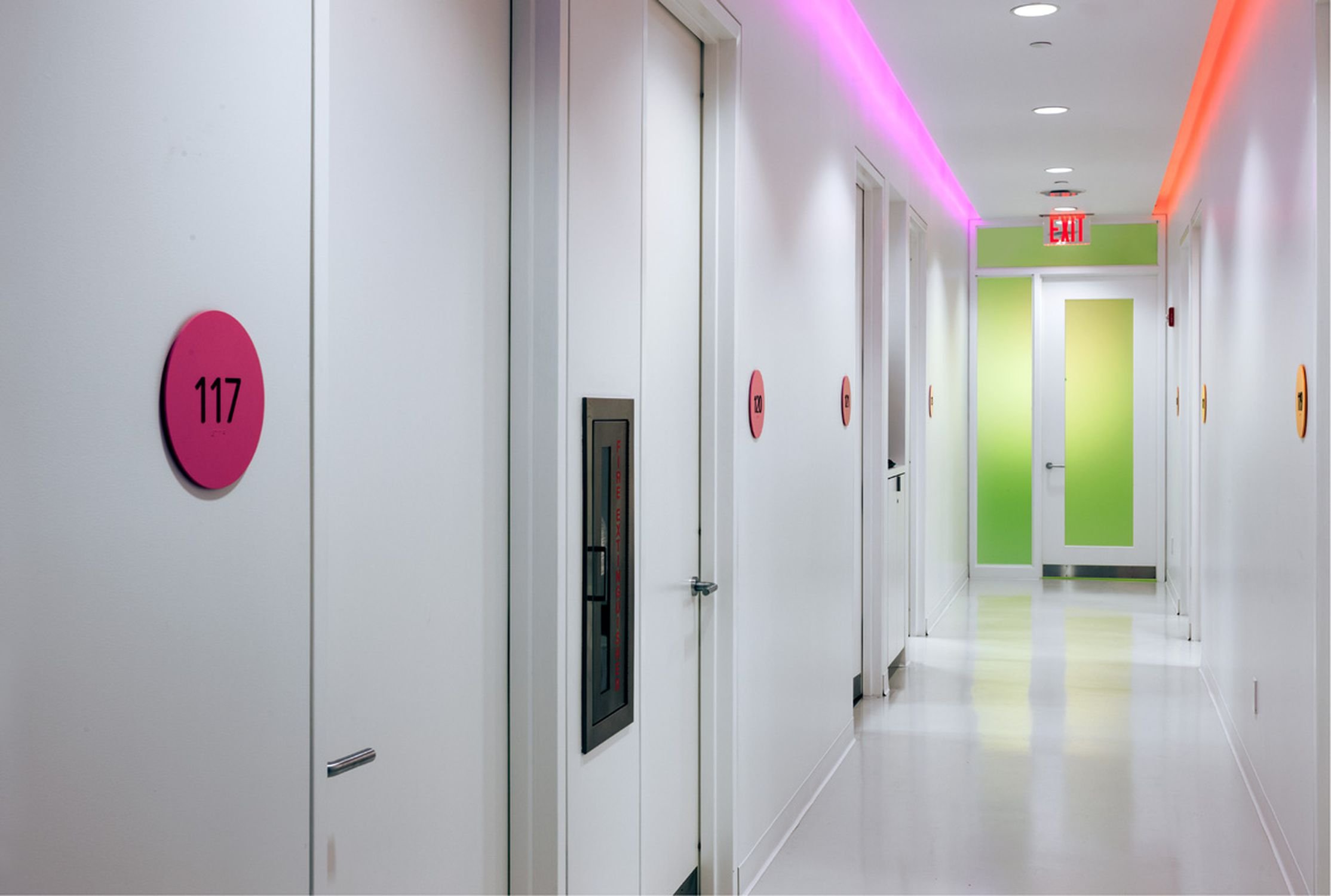
Language & Iconography Study - Room Numbering Strategy
The high-level findings of the language and iconography study revealed that patients feel uncomfortable being associated with the particular procedures, are intimidated by procedure names, and often do not identify English as their primary language.
In response to this, our team developed a room number strategy. This preserves confidentiality, avoids procedure names, allows room to be flexible in function, and caters to English and non-English speakers.
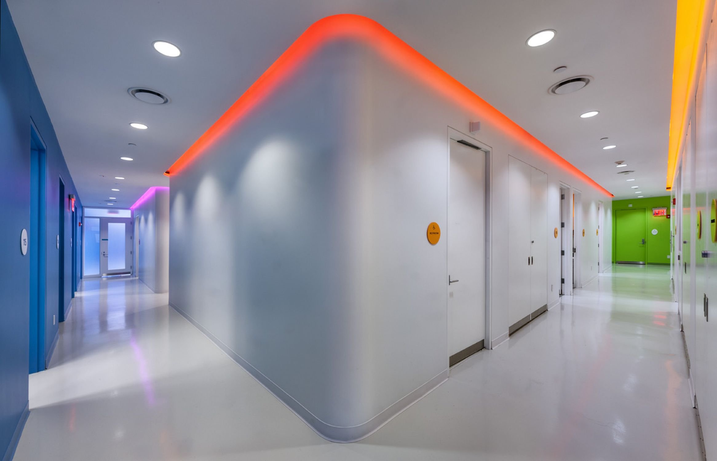
Wayfinding
In order to implement zoning, we worked with the architect to embed halo lighting in the ceiling. The use of color offers patient a general sense of orientation when finding their rooms, and gave us an opportunity to incorporate the brand colors.

Matching brand colors with paint and lighting options
RESULTS:


Brooklyn was successfully implemented in 2021 and used as a template for the Bronx location in 2022, with plans to expand across other New York locations in the future.